A New, Experimental User Interface
- March 2020
Creating an efficient user interface is hard. Modern applications attach great importance to a beautiful and practical user interface, that can be learned in a short time and that corresponds to what users already know. The interaction with websites is becoming increasingly blurred with that of classical desktop applications. Besides, the scope is continuously growing.
The complexity of Emvi's web interface is also increasing. Therefore we would like to take the opportunity to think about usability to a further extent. We see the potential for improvement in emphasizing the core features of Emvi more strongly.
The last two weeks went on to discover new ways of using web applications and we don't want to withhold the result of our work from you. We think we have found a new, interesting concept that improves the usability of Emvi.
Focus
The development of a user interface is a balancing act between focus, functionality, and appearance. Especially focus has become a difficult challenge in the last months because too many features at once overstrain the user's attention. It should be clear at all times which element of a page is currently the most important since people can concentrate on one thing only. Here is our article page for example.
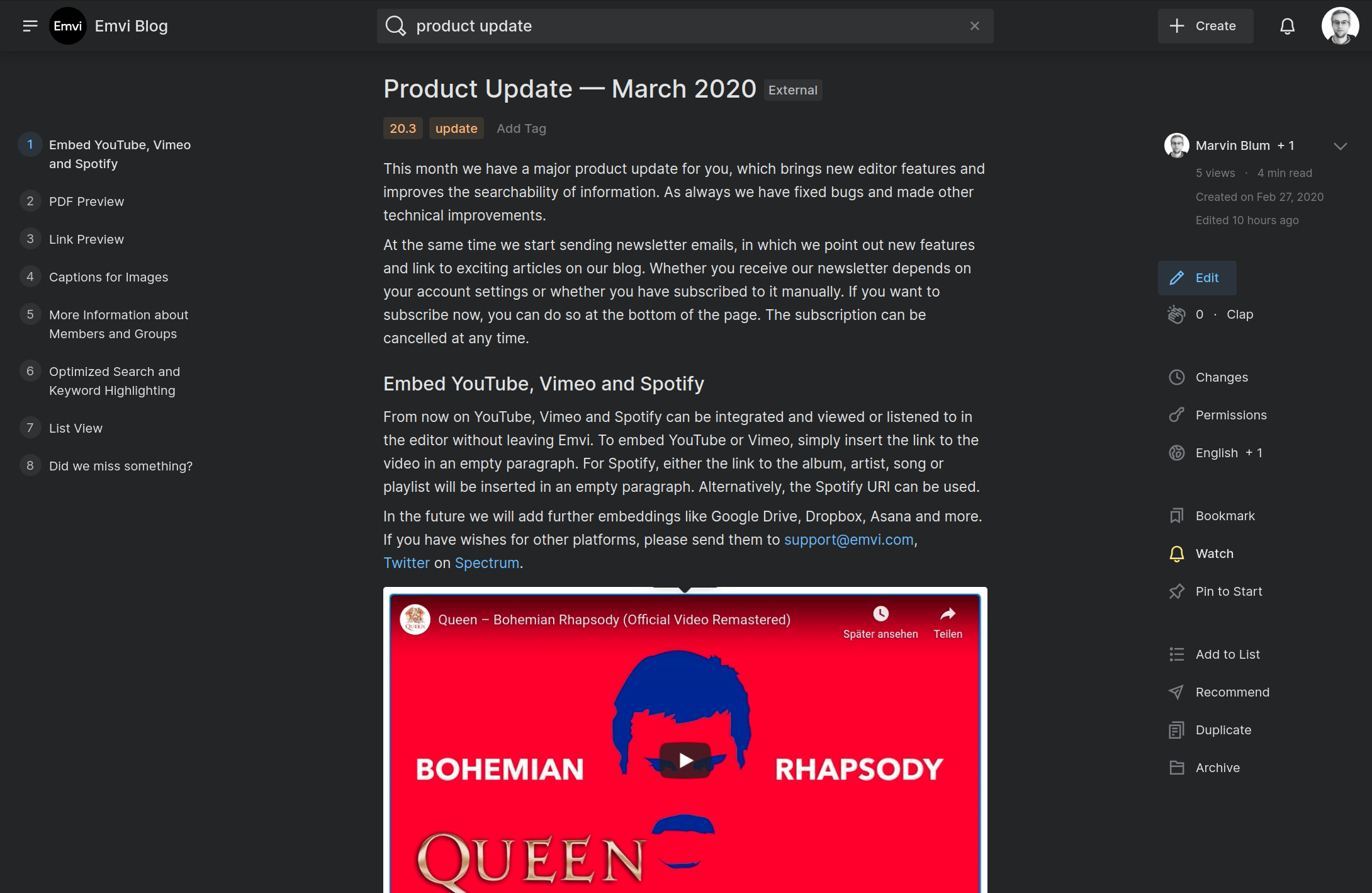
There are over 20 actions on this page, of which the fewest are actively in use. Due to the number of actions the user can perform, most of them - consciously or unconsciously - get ignored. However, the less-used features are by no means superfluous and cannot simply be removed. For example, if you want to recommend an article to colleagues, which is important for collaboration, this feature should be accessible quickly.
The Three Dots
A solution to this problem is "the three dots", which we encounter frequently. By this, we mean the ellipsis icon that is used to hide features behind a dropdown menu.
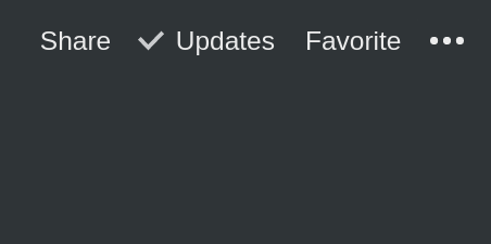
By hiding those actions, the user is less distracted and can concentrate on the essentials. At the same time, however, other actions are threatened to be overlooked. Users tend to discover these features only after a longer period of use. Prominent examples of such features are sharing, import and export and permission settings.
We noticed this disadvantage right from the beginning of Emvi's development. We, therefore, decided to communicate features as transparently as possible. As an example, all our buttons are labeled and do not exclusively show which function it fulfills via an icon.
Our goals in the development of a user interface are, therefore:
a clear focus on the central function of a page, to draw attention to them and not to overwhelm the user
not to omit or hide any relevant features
a balance between information density and clarity
A New UI Concept
Since we could not find a solution to this challenge in classical web design, we were looking for a new interface concept. As Emvi is centered around reading and writing, we had the idea for an interface that can be completely controlled by the keyboard. Many web applications offer shortcuts to call up actions quickly. However, we have not yet come across a web interface where every aspect of the application can be controlled by the keyboard. The idea for a "command line" in the browser was born.
The advantages of this concept are:
- few elements on the user interface, therefore less distraction
- everything can be operated via a single menu, the interaction is consistent
- after a short period, Emvi can be controlled very efficiently, no need to search for buttons, the mouse is practically superfluous
- new features can be added easily without overwhelming the user or hiding them behind a dropdown menu. The interface scales well
- the development effort of the user interface is reduced, which allows us to iterate more quickly. At the same time, the interface is less error-prone, since the same concept is applied each time
The Prototype
During the development of the prototype, we reduced the user interface as much as possible. Navigation, search and page features are combined in a command-line — an input field with extended functionality.
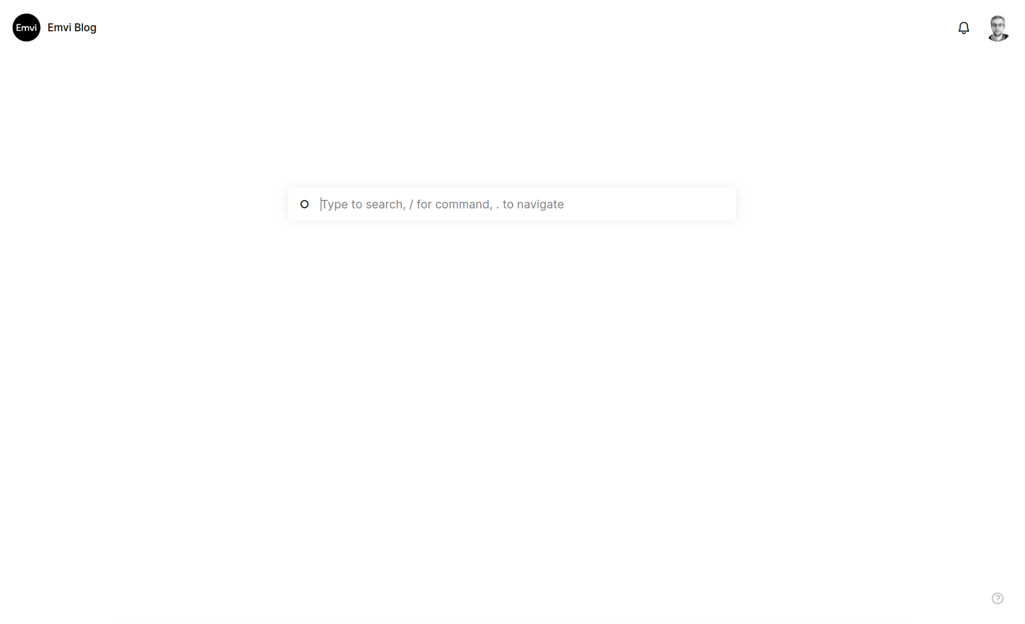
As you can see, there is only one primary element in the center of the page, which attracts the full attention of the user. To access the command line on other pages, you can open it at any time by using the Ctrl + Space shortcut.
The user can perform one of the following three actions:
- navigate the page by starting with a . (dot)
- execute a command by starting with a / (slash)
- or search everything
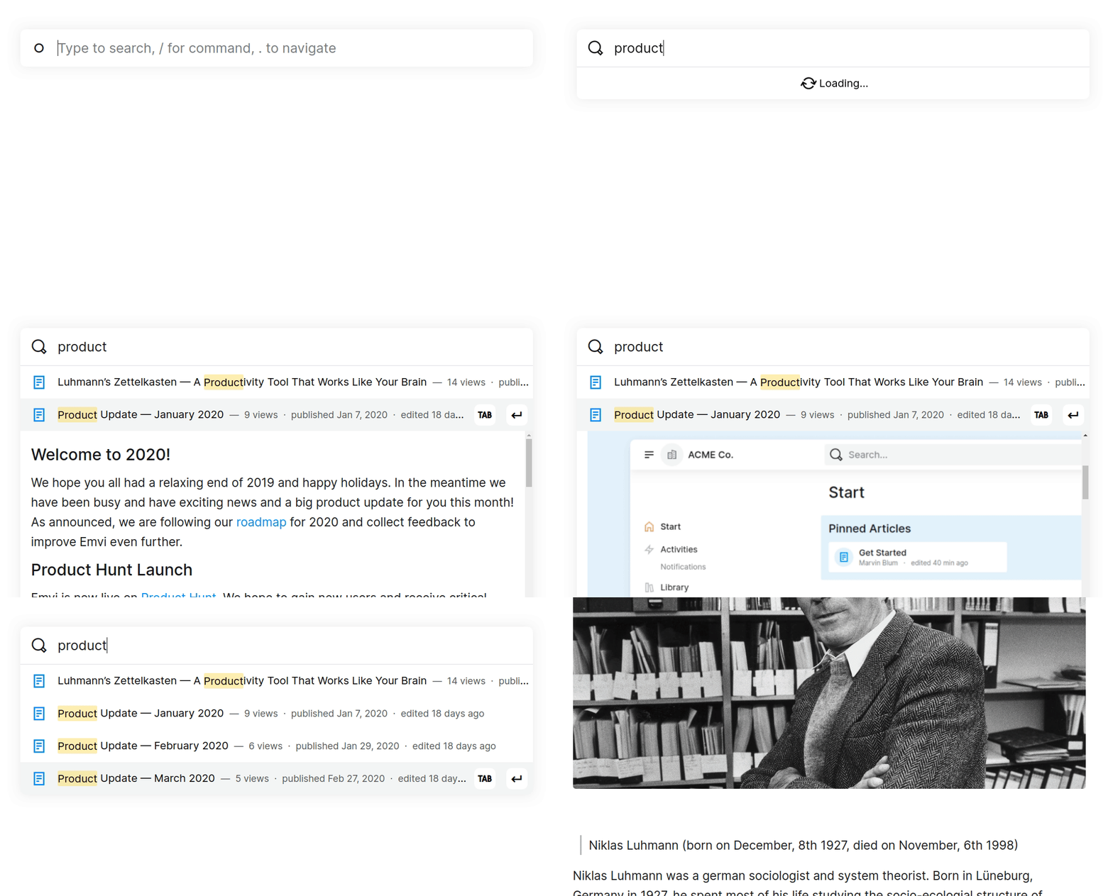
When you start typing a command or a page name it gives a range of suggestions. Use the arrow keys to select a suggestion and confirm with Enter — the first entry is preselected. Commands and page names can be autocompleted by pressing Tab.
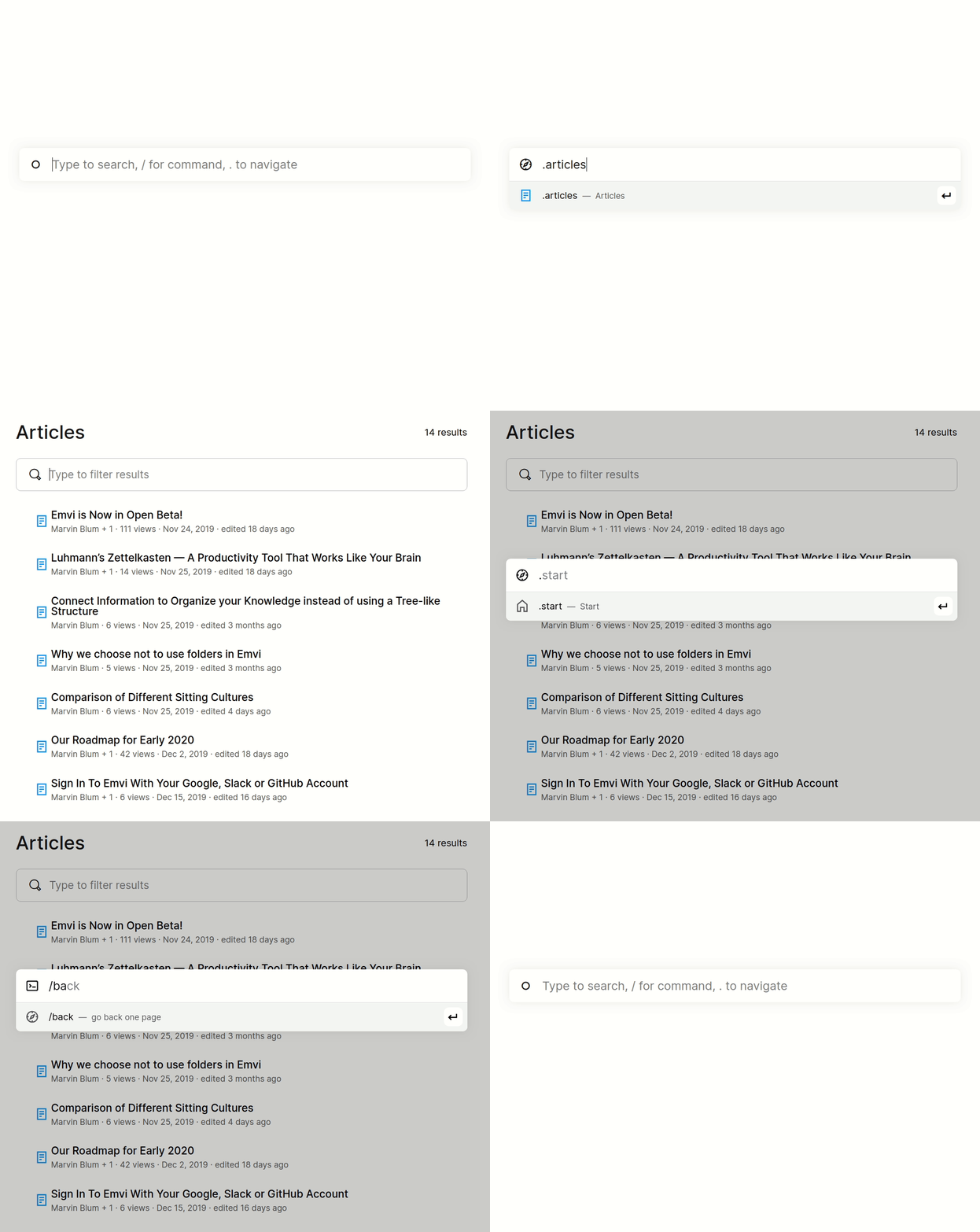
To limit the actions the user can perform, commands are context-sensitive. Only commands that can be used on the current page are suggested. All commands are available in English and German. This is realized via aliases. For example, if you enter /zurück, the original English command is also displayed.
Similar to the current text search in the menu, it delivers the most relevant results. A result can be selected using the arrow keys and opened by pressing Enter. If you press Tab, a preview of the result is displayed, which can be scrolled within using the arrow keys.
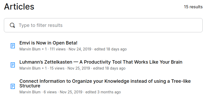
In addition to the command line, the prototype also includes the article overview, the article page, and the editor. The article overview can also be controlled by the arrow keys, Enter and Tab. Additionally, an input field can be used to filter the results.
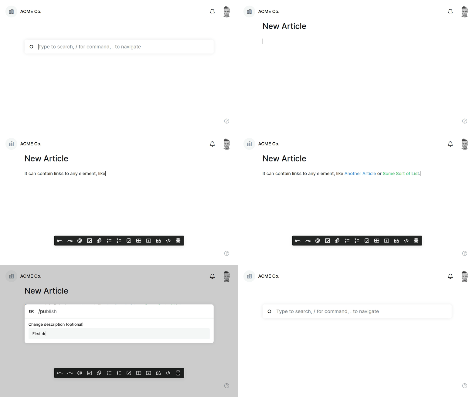
After a short familiarization, the user interface can be operated completely by the keyboard. Once you have learned the commands, it can be used without the mouse.
You can try our prototype yourself. If you do not have an Emvi account yet, go ahead and create one here. You must also be a member of an organization. You can either create one yourself or join an existing one by getting invited by an administrator. To access the prototype, simply add experimental/ at the end of the URL in the address bar of your browser after opening any organization.
https://my-organization.emvi.com/
turns into
https://my-organization.emvi.com/experimental/
Note the slash at the end of the URL.